Bill of Rights Posters
Typesetting & Layout
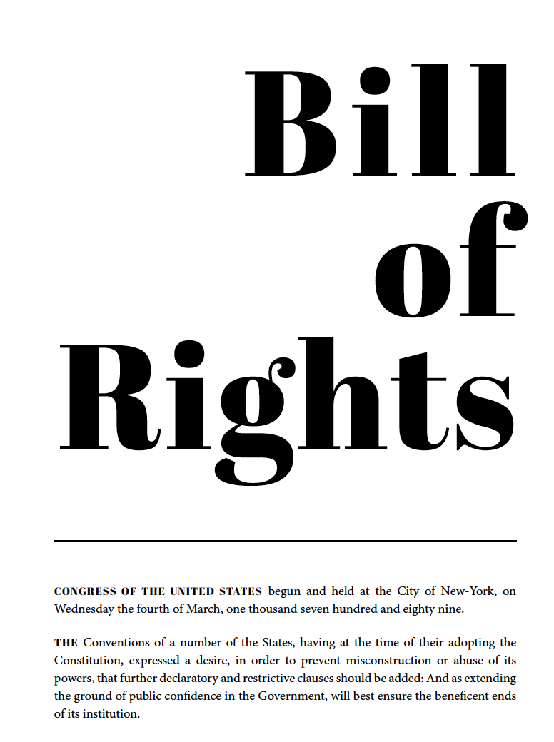
Two unique poster designs for both the 1789 pre-ratified and 1791 ratified versions of the United States Bill of Rights. The pre-ratified document is limited to a black and white color palette, therefore mimicking original broadsides of the time period. The use of bold display type and a structured grid system work together to pay tribute to the traditional broadsides.
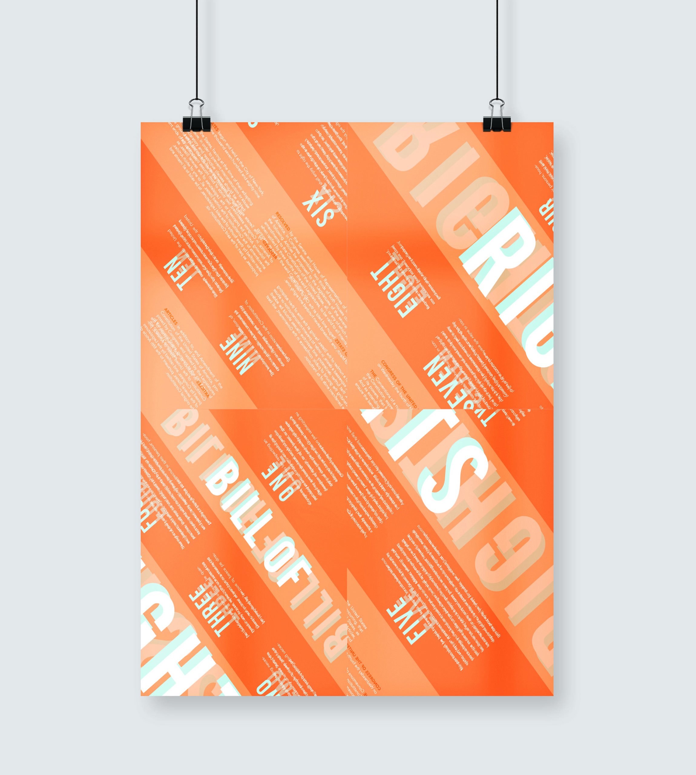
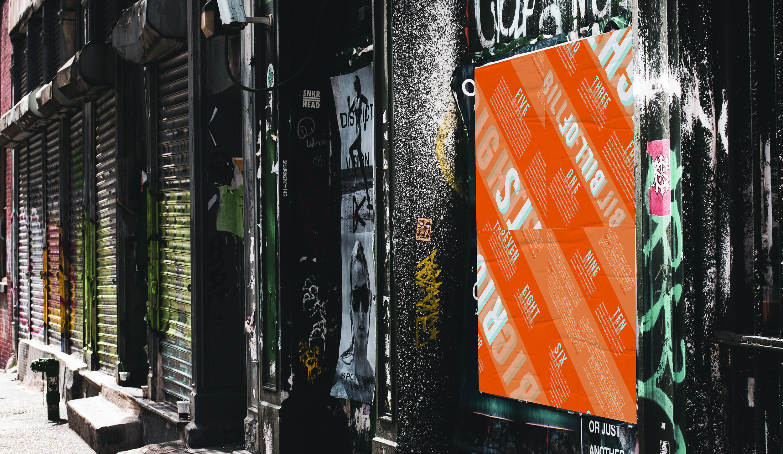
The concept behind the experimental ratified version of this important document focuses on how far people are willing to go to actually read and understand what the amendments mean. To most of us, they are worded in a way that makes them extremely confusing and difficult to comprehend. This idea comes into play with the puzzle-like orientation and legibility of the text. Split into four pieces, each piece is placed in random corners out of order and therefore requires the audience to work that much harder to read and understand the amendments.
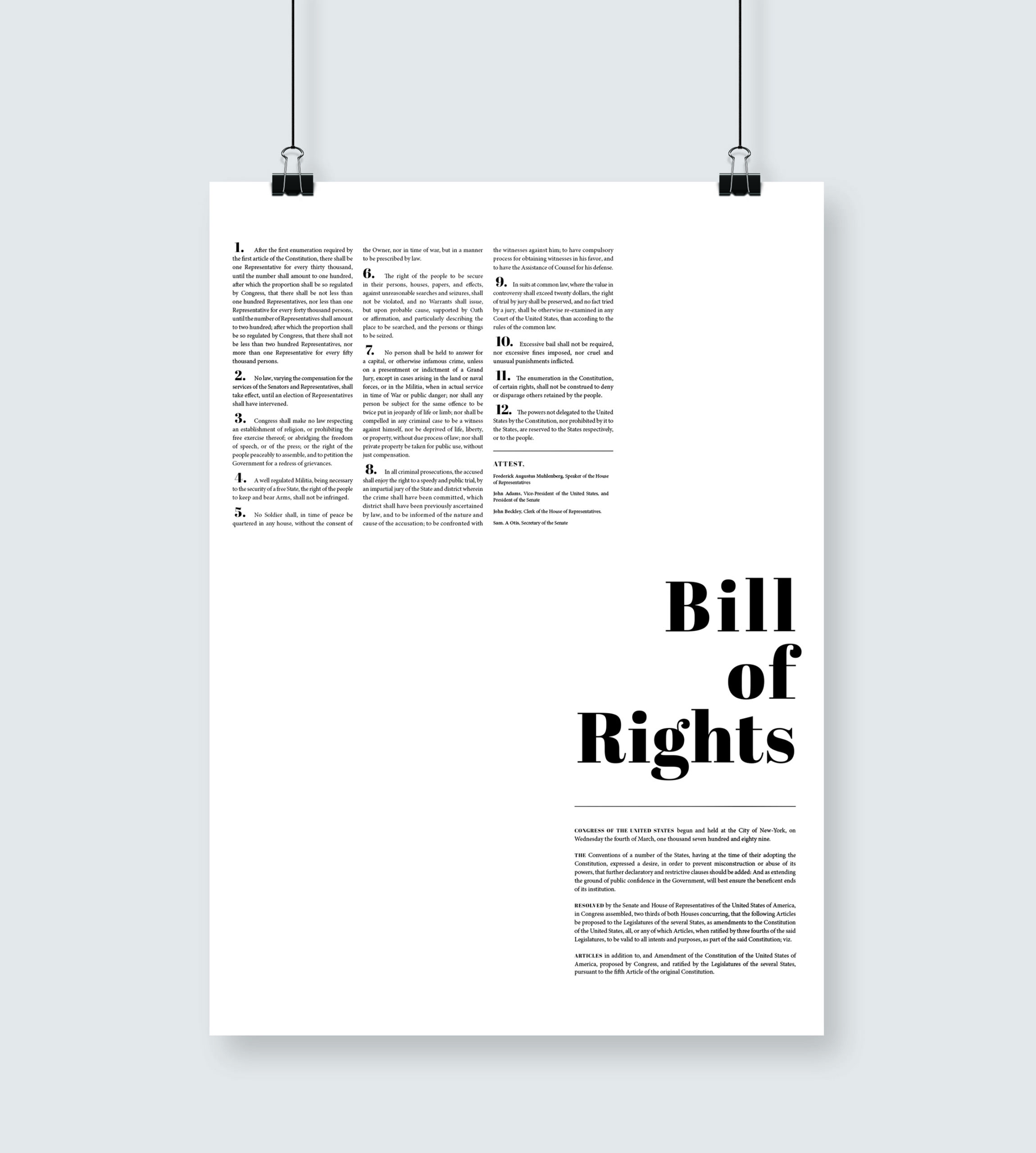
Traditional
Pre-ratified 1789 Version of the Bill of Rights
With 12 amendments, this traditional version of the Bill of Rights follows the theme of structure and order. With a simple list, it is easy to follow from number 1 all the way through 12. It’s easy to read, go ahead. Read them.
Contemporary
Ratified 1791 Version of the Bill of Rights
Chaos. Chaos. Chaos. That’s what this poster revolves around. I’m sure you could list some of the amendments in the Bill of Rights, but could you list them all and define what exactly they mean? Exactly. So how far are you willing to work to try and comprehend what exactly these amendments stand for and say? Can you read upside down…?