Cooper & Cameron Bakery
Branding
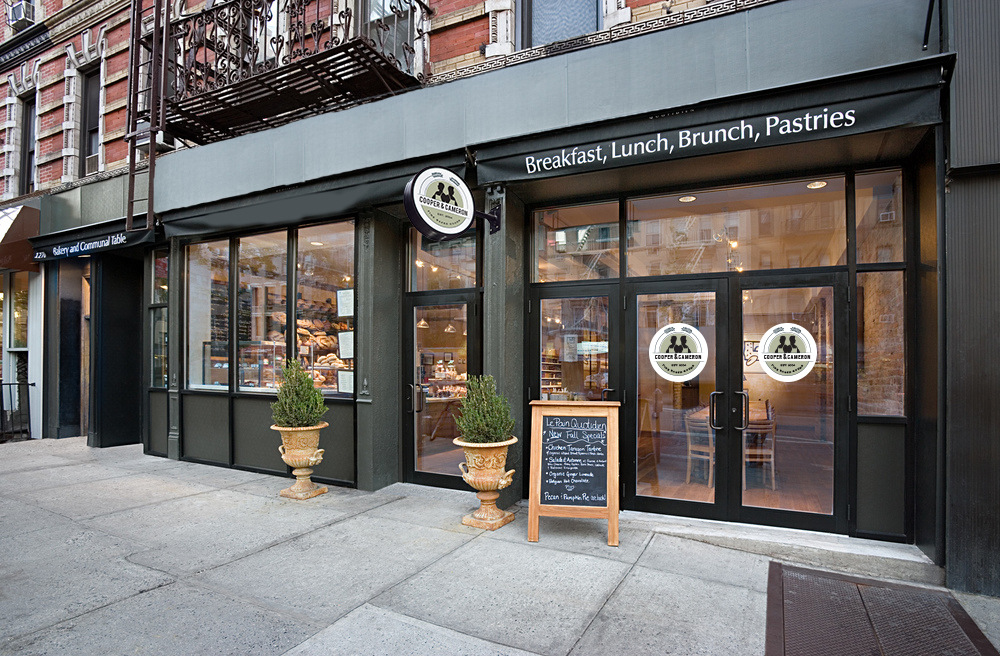
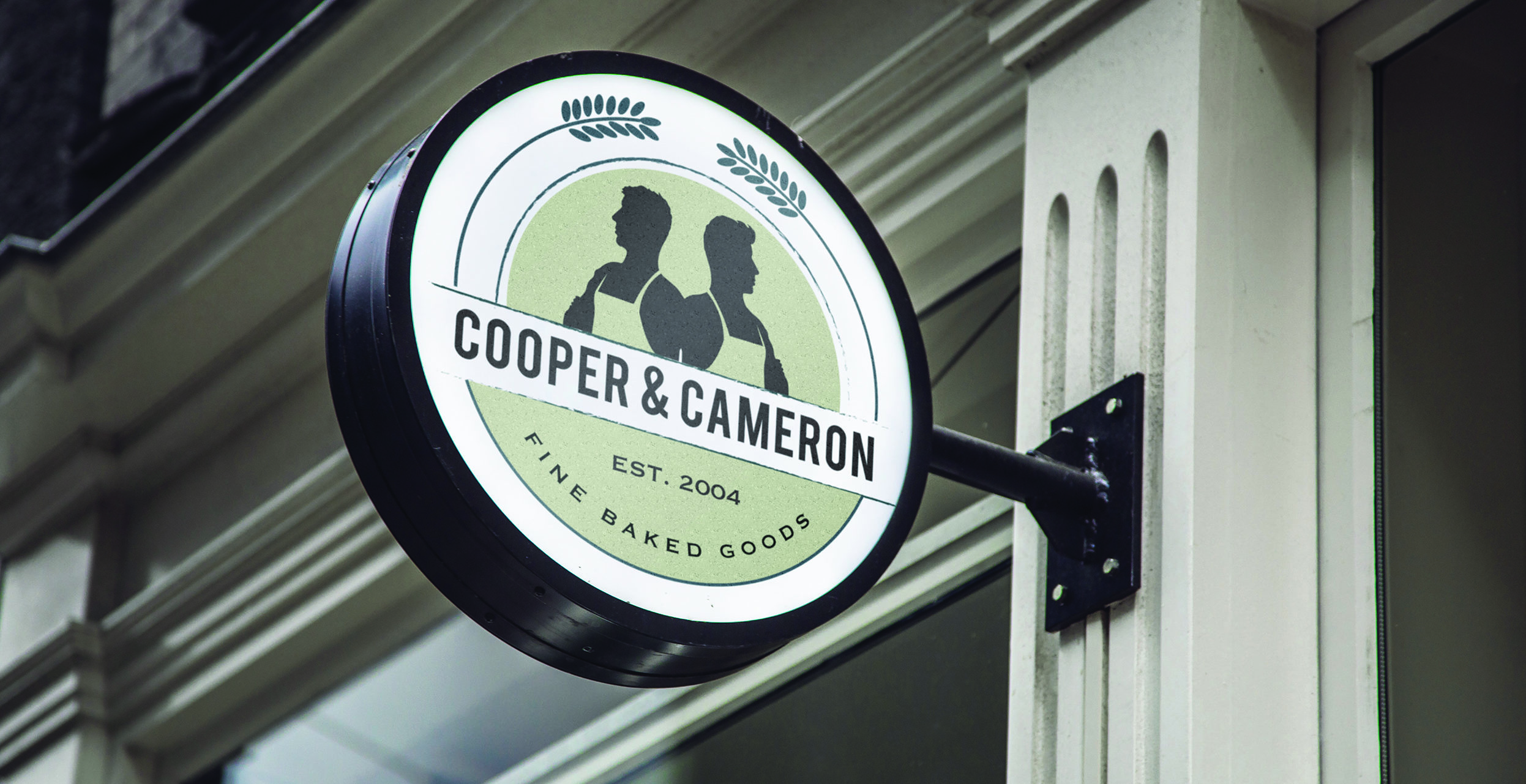
Located in New York City, Cooper and Cameron Bakery was developed by two brothers, Cooper and Cameron. By placing two silhouettes back to back, the logo symbolizes the brothers as the backbone of the company that work together as equals to make it run smoothly. The wheat abstractly finishes the circle badge shape of the logo while giving passing customers visual cues as to what the company is.
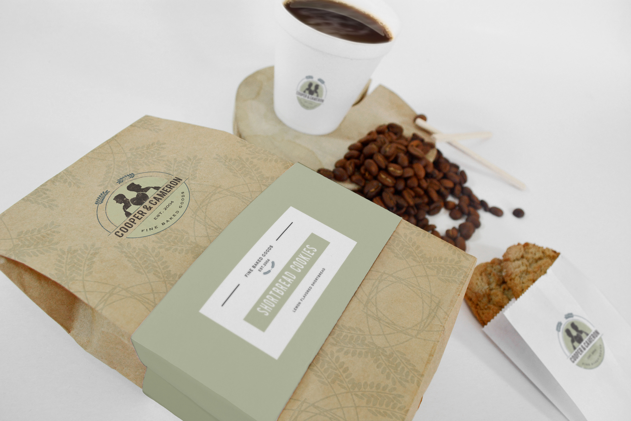
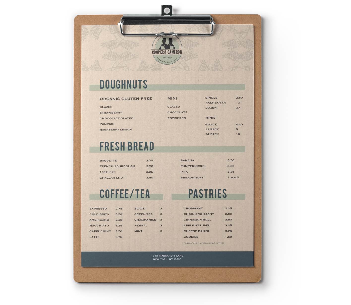
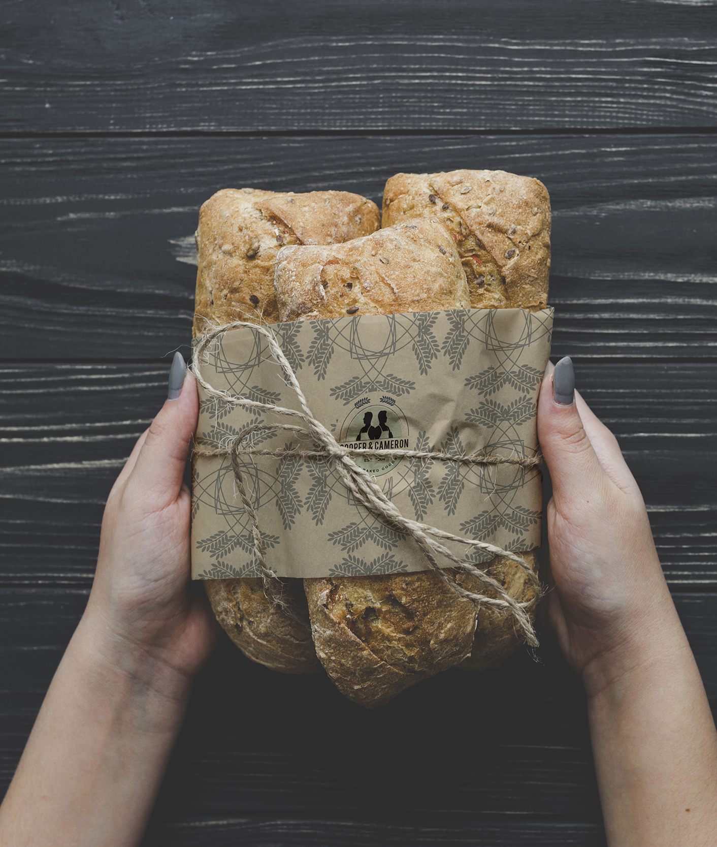
The wheat in the logo is then used as the brand’s pattern which can be found on various touch-points such as the packaging and menu. This locally run bakery focuses on a sense community that brings customers together for a casual place to study or hang out with friends.
Bakery Menu
This clipboard menu can be found on the tables and coffee tables located throughout the bakery to aid in accessibility for the customers casually enjoying their time in the bakery.
Bakery Packaging
The wheat motif is showcased and used on all of the packagings for the bakery goods. This creates a sense of familiarity and makes the brand recognizable.
